
Drawing the Line: How a simple curve changes how we make decisions
- Mohamed Hassan

- Jun 23, 2022
- 4 min read
In 2014 there was a huge debate between CATO Institute and Professor Jordan Ellenberg for a post published by CATO Institute titled "Why Is Obama Trying to Make America More Like Sweden when Swedes Are Trying to Be Less Like Sweden?"
The post was short and simple it had one argument that was:
A Swedish economics student makes three important points. 1- Sweden became a rich nation in the late 1800s and first half of the 1900s by relying a free markets and small government. 2- Growth deteriorated beginning in the 1970s after the imposition of high tax rates and a big increase in the burden of government spending. 3- For the last 20 years, Swedish lawmakers have been trying to restore prosperity by lowering tax rates and adopting pro‐market policies. So if Swedes have learned from their mistakes and are now trying to reduce the size and scope of government, why are American politicians determined to repeat those mistakes? This is something to keep in mind with a looming vote on a giant expansion of the welfare state.
In his book "How Not to Be Wrong" Jordan Ellenberg, cited this post as one of the examples of having linear thinking which is assuming a linear relationship between two variables and making conclusions based on this assumption. and in this case, the linear relationship was between prosperity and tax rate,
To the CATO institute if Sweden is pushing to reduce their tax rate it must mean that they realized that the more the tax rate the less prosperous they become and America while pushing towards encreasing tax rate should learn from Sweden and avoid going in that direction (since it's proven to be bad).
Jordan Ellenberg visualized their argument as follows:
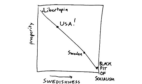
And if this visualization was true it makes absolutely 100% sense that America shouldn't increase their tax rates. But Ellenberg argued that this way of interpreting events is misleading because not or lines are straight lines and not all relationships are linear.
He then proposed a different non-linear graph where both increasing and decreasing tax rates can lead to more prosperity depending on where they are in the graph.
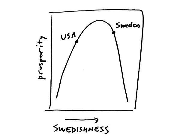
This graph suggests that there's a point that once reached increasing the tax rate will lead to less prosperity so does decreasing the tax rate. and it also suggests that Sweden passed this point and they realized that it lead to less prosperity so they started reducing the tax rate while America hasn't yet reached this point and that's why they should increase the tax rate until they reach it. And if this graph was correct it makes absolutely 100% sense that America should increase its tax rate despite Sweden reducing it.
In a blog post, Ellenberg also suggested that the graph doesn't have to be a single smooth hill it could look like a trapezoid, dromedary’s back, or a wildly oscillating free-for-all.


What all these graphs share in common is that at 0% the prosperity is at its lowest and so does at 100% and here's why:

This graph visualizes the relation between tax rate and government revenue and it shows that at a 0% tax rate the government revenue is 0 and the same for a 100% tax rate. Ellenberg explains that the reason behind this would be people shifting to the informal economy where the government won't be able to track their earnings because it makes zero sense to earn money when 100% of it will go to the government.
Now back to the America and Sweden example, if both the CATO and Ellenberg agree on the nonlinear relationship, CATO could debate about where to place America and Sweden on this graph; because placing America after the hill means that America's tax increase decision is leading to a decrease in prosperity and so CATO's point of following Sweden and reducing tax rate would seem to be the right decision. Choosing the graph to visualize this problem will either make a wise decision or a very stupid one and that's what I believe Ellenberg was trying to prove here. Going with the linear graph meant one thing and one thing only the lower the tax rate the better, while choosing a nonlinear graph meant that both options are valid and they need more calculations and understanding to determine which decision is better. Assuming a linear relationship will mislead us into making a wrong decision and that decision could seem to be right to a certain extent (if we assumed a linear relationship and America was after the hill this will mean the decision to reduce the tax rate will be the right once but once the hill is passed again reducing the tax will lead to a decrease in prosperity) This way of thinking is important in making better decisions not just in economy or business but in our everyday life in general; sometimes we think the more we put into something the better the output will be (linear thinking) and we keep investing time, money, and effort into something in hope of better results but we might not get the results we hope for and it's not because there's something wrong with us it's because that how things are.
Drawing the right line will give us an indication of when to keep moving forward, when to head back, and when to quit. There's another great book about quitting called The Dip by Seth Godin where Godin suggests three different graphs that help us understand the actions and results in a better way.
Thoughts?


Comments